Selling or buying a home can be an extremely stressful time. Even though Sellers may be moving on to something better, they still try to preserve the memory of the home they’ve lived in by keeping their personal items, collections, and memorabilia in view of Buyers who will be touring their home.
It’s hard to let go, but if Buyers want to get the maximum amount of money for their home in the shortest amount of time, they need to de-personalize their home and stage it to appeal to the maximum number of Buyers. When someone tours a home, they want to visualize living there and seeing the potential of their own furnishings and personal items in the space. They’re not interested in how many trophies Susie won in gymnastics. And the spare bedroom you have dedicated to Disney memorabilia is only going to look like clutter to a potential Buyer.
Bringing it down to relationships, Sellers will take their memories with them of all the holidays, get-togethers, and special times that were created in their home. New Buyers want to do the same. They want to walk through your home and envision holidays and making their own special memories. And that’s what you want! “MAKE ME AN OFFER!”
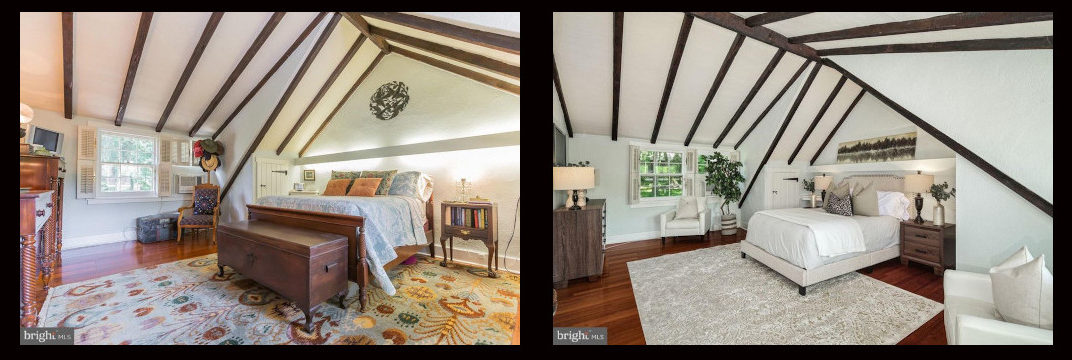
These images show examples of Before & After home staging that will appeal to the maximum number of Buyers.

Although the room has cozy furnishings, there’s a little too much going on here with fabrics and pattern styles that tends to close in the room due to the pitched ceiling. Using a neutral color palette and more modern furniture pieces makes the room appear larger, yet still cozy by having some texture in the rug and pillows.


We love our collections, but when selling a home it’s best to put away personal items that can make a room look cluttered.
When you have a feature wall, such as the stone wall shown here, it’s best to showcase that instead of covering it up with bulky furniture pieces. The modern, lighter-colored furniture and minimalist artwork works well to make this a comfortable, inviting space.

The wood-beamed ceilings and windows are the focal points of the room, and the ornate furniture in the Before photo competes with that; it detracts from the room’s architectural features.
The sleek, modern furniture in the After photo allows the attention to be drawn to the beautiful ceiling and the natural light coming in through the windows.

In the Before photo it looks like some updates were done, while still keeping some of the original charm, like the beadboard pantry and the dish rack display on the wall, but many of the design elements aren’t cohesive.
The After photo leaves out the distracting accessories that aren’t adding to the value of the updates that have been done. Instead, more organic elements, such as the wall baskets, straw placemats, and planter give the Kitchen more of the Modern Farmhouse feel and showcase the updates without competing with them.
*Sunrize Connection contributed to the narrative regarding this staging in an article for Bright MLS for Realtor.com

